Projected World Population Density 2025 Heat Map
Understanding Global Demographics
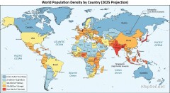
This map provides a visual projection of world population density by country for the year 2025. Utilizing a vivid heat map style, the visualization color-codes nations based on the number of inhabitants per square kilometer. The scale transitions from a cool blue representing low-density areas (under 25 people/km²) through yellow, culminating in a hot red for high-density regions (over 500 people/km²).
Key Density Indicators and Trends
A comprehensive gradient legend serves as a guide to the specific density ranges. Furthermore, the map explicitly labels the most densely and least densely populated countries, offering immediate insight into global extremes. Analyzing these projected 2025 figures is crucial for understanding potential future demographic shifts, urbanization trends, and increasing pressures on resources in highly concentrated areas.

More World Static Maps
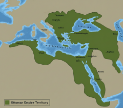
Ottoman Empire Map: Imperial Height & Decline (1683)
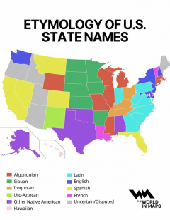
US State Name Origins: An Etymological Map
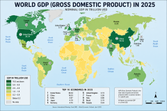
World GDP by Country 2025 Map: Top Economies and Global Economic Scale
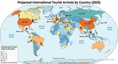
Projected 2025 World Map: International Tourist Arrivals
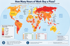
Hours of Work for a Pizza: Global Minimum Wage vs Big Mac (2024)
Projected World Population Density 2025 Heat Map
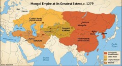
Mongol Empire 1279 Map: The Four Khanates at Their Peak
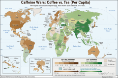
Caffeine Wars: Coffee vs. Tea Consumption by Country (Per Capita)
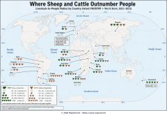
Where Sheep and Cattle Outnumber People (Global Ratios)
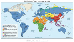
World Map: Distribution of Major Language Families
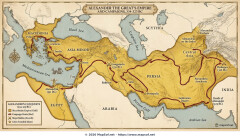
Map of Alexander the Great's Conquests (334–323 BC)
Most Common First Names in Europe – Country-by-Country Map
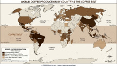
World Map: Coffee Production by Country & The Coffee Belt
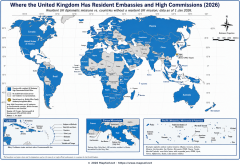
Where the UK Has Resident Embassies and High Commissions (2026)
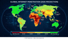
Global Internet Connectivity Map: 2025 Projected Penetration Rates
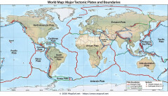
World Map of Major Tectonic Plates, Boundaries, and Geohazards
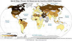
World Map: Projected Proven Oil Reserves by Country, 2025
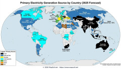
Dominant Electricity Sources Worldwide 2025 Forecast Map
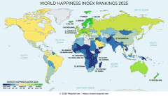
2025 Global Happiness Index Map: Country Rankings & Scores
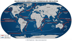
Global Ocean Currents Map: Warm, Cold, and Thermohaline Circulation
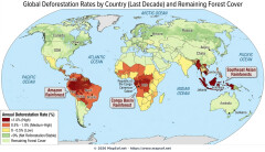
World Map: Deforestation Rates and Forest Cover (Last Decade)
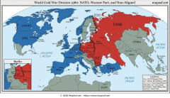
Cold War Map 1980: NATO vs Warsaw Pact & Iron Curtain
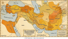
Achaemenid Persian Empire Map 500 BC: Satrapies Under Darius I
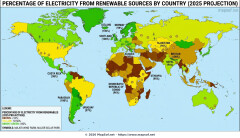
Projected 2025 World Map: Renewable Electricity Percentage by Country
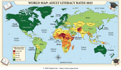
World Adult Literacy Rates Map 2025 Forecast
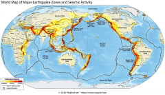
Global Seismic Activity Map: Major Earthquake Zones & The Ring of Fire
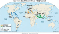
Projected World Migration Flows 2025 Map
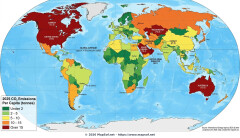
Projected World CO2 Emissions Per Capita Map 2025
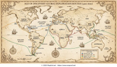
Age of Discovery: Voyages of Columbus, da Gama, Magellan & Drake