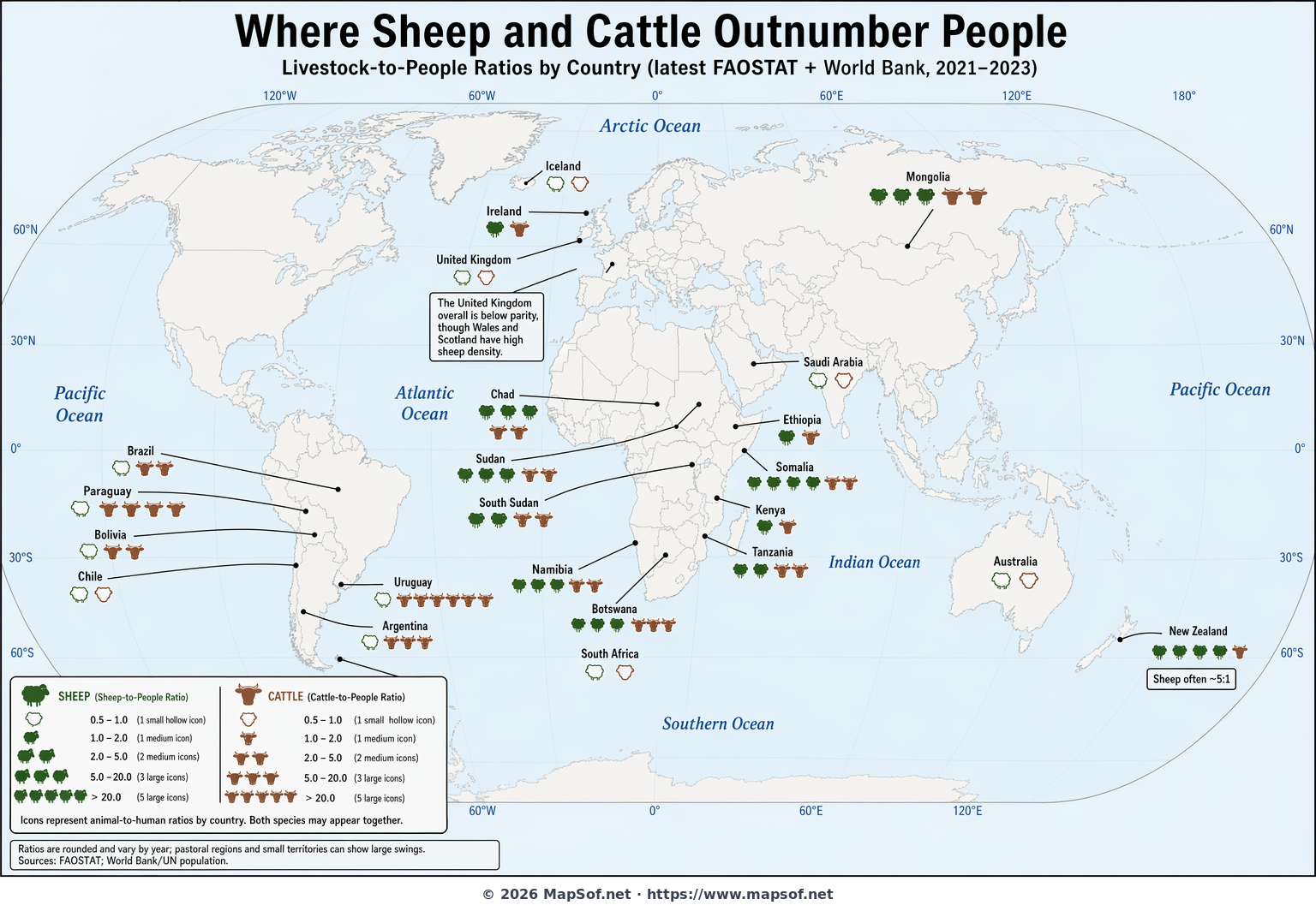
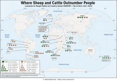
Where Sheep and Cattle Outnumber People (Global Ratios)
This world map spotlights countries where farm animals—specifically sheep and cattle—can outnumber the people who live there. Instead of a color gradient, the design uses small, repeated vector icons to show intensity: green sheep silhouettes and ochre cattle heads scale and multiply as the animal-to-human ratio rises. The result is an immediately readable picture of livestock-heavy societies, from ranching powerhouses in South America to pastoral landscapes in Oceania and Central Asia.
What stands out? New Zealand’s enduring reputation for more sheep than people remains visible, while Uruguay and parts of the Southern Cone showcase exceptional cattle density. Mongolia’s flocks dominate its vast steppes, and the remote Falkland Islands famously display one of the world’s highest sheep-per-person ratios. The map also calls out Ireland for its cattle prevalence and notes that subnational patterns (like Wales and Scotland) can be intense even when national totals are below parity. A concise legend explains the ratio bins, and a source note reminds viewers that figures vary by year and dataset.
Why it matters
Livestock-to-people ratios reveal how societies use land, water, and grasslands, shaping economies, cuisines, and export profiles. They also hint at environmental pressures—such as pasture expansion and methane emissions—that accompany animal agriculture. This icon-driven map provides a clear, engaging way to compare regions and spark deeper questions about sustainability, food systems, and rural livelihoods around the world.
More World Static Maps
Ottoman Empire Map: Imperial Height & Decline (1683)
US State Name Origins: An Etymological Map
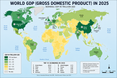
World GDP by Country 2025 Map: Top Economies and Global Economic Scale
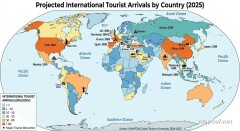
Projected 2025 World Map: International Tourist Arrivals
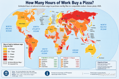
Hours of Work for a Pizza: Global Minimum Wage vs Big Mac (2024)
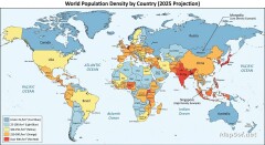
Projected World Population Density 2025 Heat Map
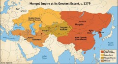
Mongol Empire 1279 Map: The Four Khanates at Their Peak
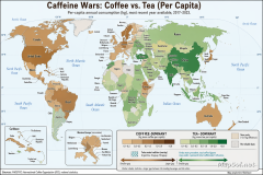
Caffeine Wars: Coffee vs. Tea Consumption by Country (Per Capita)
Where Sheep and Cattle Outnumber People (Global Ratios)
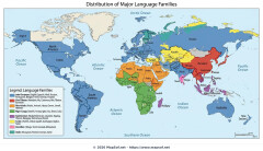
World Map: Distribution of Major Language Families
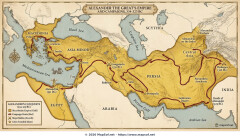
Map of Alexander the Great's Conquests (334–323 BC)
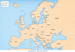
Most Common First Names in Europe – Country-by-Country Map
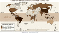
World Map: Coffee Production by Country & The Coffee Belt
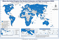
Where the UK Has Resident Embassies and High Commissions (2026)
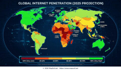
Global Internet Connectivity Map: 2025 Projected Penetration Rates
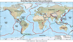
World Map of Major Tectonic Plates, Boundaries, and Geohazards
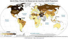
World Map: Projected Proven Oil Reserves by Country, 2025
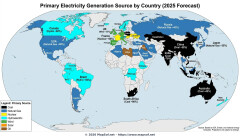
Dominant Electricity Sources Worldwide 2025 Forecast Map
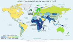
2025 Global Happiness Index Map: Country Rankings & Scores
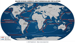
Global Ocean Currents Map: Warm, Cold, and Thermohaline Circulation
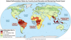
World Map: Deforestation Rates and Forest Cover (Last Decade)
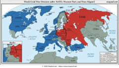
Cold War Map 1980: NATO vs Warsaw Pact & Iron Curtain
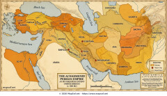
Achaemenid Persian Empire Map 500 BC: Satrapies Under Darius I
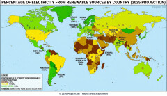
Projected 2025 World Map: Renewable Electricity Percentage by Country
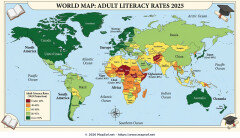
World Adult Literacy Rates Map 2025 Forecast
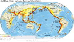
Global Seismic Activity Map: Major Earthquake Zones & The Ring of Fire
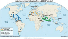
Projected World Migration Flows 2025 Map
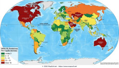
Projected World CO2 Emissions Per Capita Map 2025
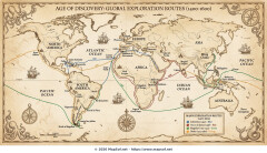
Age of Discovery: Voyages of Columbus, da Gama, Magellan & Drake